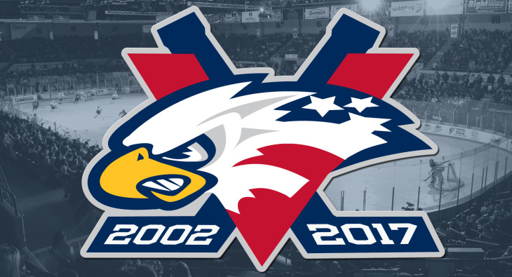
Saginaw Spirit unveil 15th anniversary logo

By @MichaelCaples –
As the Saginaw Spirit prepare to celebrate the OHL franchise’s 15th anniversary season, they have debuted a new logo.
Announced at noon today, the Spirit have a new logo that commemorates the franchise’s 15 years of operation in Saginaw. The new look incorporates the 2002-2017 span of the program, along with the team’s original color scheme of Midnight blue, red, silver, white and yellow. The blue sticks in the logo create a V and the red conveys a V to spell out 15 with Roman Numerals.
The team will display the new logo on their helmets for the 2016-17 season.
From Spirit owner Craig Goslin:
“Going into our 15th season, on behalf of Dick Garber, our local Meijer stores, and our premier sponsor Saginaw Valley State University, it is an honor for the Saginaw Spirit Hockey Club to provide the Great Lakes Bay Region with world class sports entertainment. This season, we will surpass the Saginaw Gears with record setting attendance for a Saginaw sports team. Our entire community should be proud, as we all have worked together to make our region a better place to live, work and to play. We are grateful to our players, alumni, season ticket partners, our group ticket partners, and our corporate sponsors for their support in making the Saginaw Spirit a 15-year community success story. Prosperity in anything is typically all about the quality of your people and we have a fabulous staff of people that work for the Spirit, on and off the ice. They are committed to being the best at what they do. I cannot wait to see what additional positive developments will occur in and around our Riverfront Saginaw District during the next 15 seasons. This is another example as to why we all should be proud to call Saginaw, Sagin-Awesome!”

